18.2.2026
#Aesthetics
AI + Modern Communications
The aesthetics of the 90s and 00s were a tale of two worlds. On one hand, there were early video games that had countable pixels on the screen and a burgeoning internet that could only handle dial-up load speeds. On the other, there was the promise of a Brave New WorldTM featuring a slick style that ultimately led to Frutiger Aero and a world where every electronic device welcomed you into a pristine glossy phantasmagoria.
Tamagotchi. Mario's pixelform mustache. Cheap pulp TV guides.
iMac G3. iPod Touch. Lisa Frank.
The promise was that one of those worlds would catch up to the other. One day in the not-so-distant future, video games would be perfect replicas of real life. Digital photography could capture a moment exactly as it was. Phone screens would soon be as clear as the human eye.
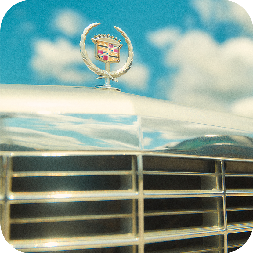
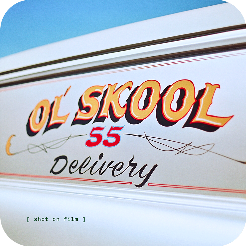
So when new video games came out featuring heavily stylized cartoon graphics and creators started intentionally damaging pristine digital images with high-speed film grain, torn paper textures, printing dots, Xerox dynamic range, pixelation, or jpeg artifacts, it seemed tantamount to heresy.
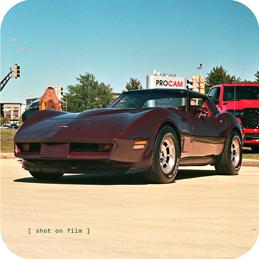
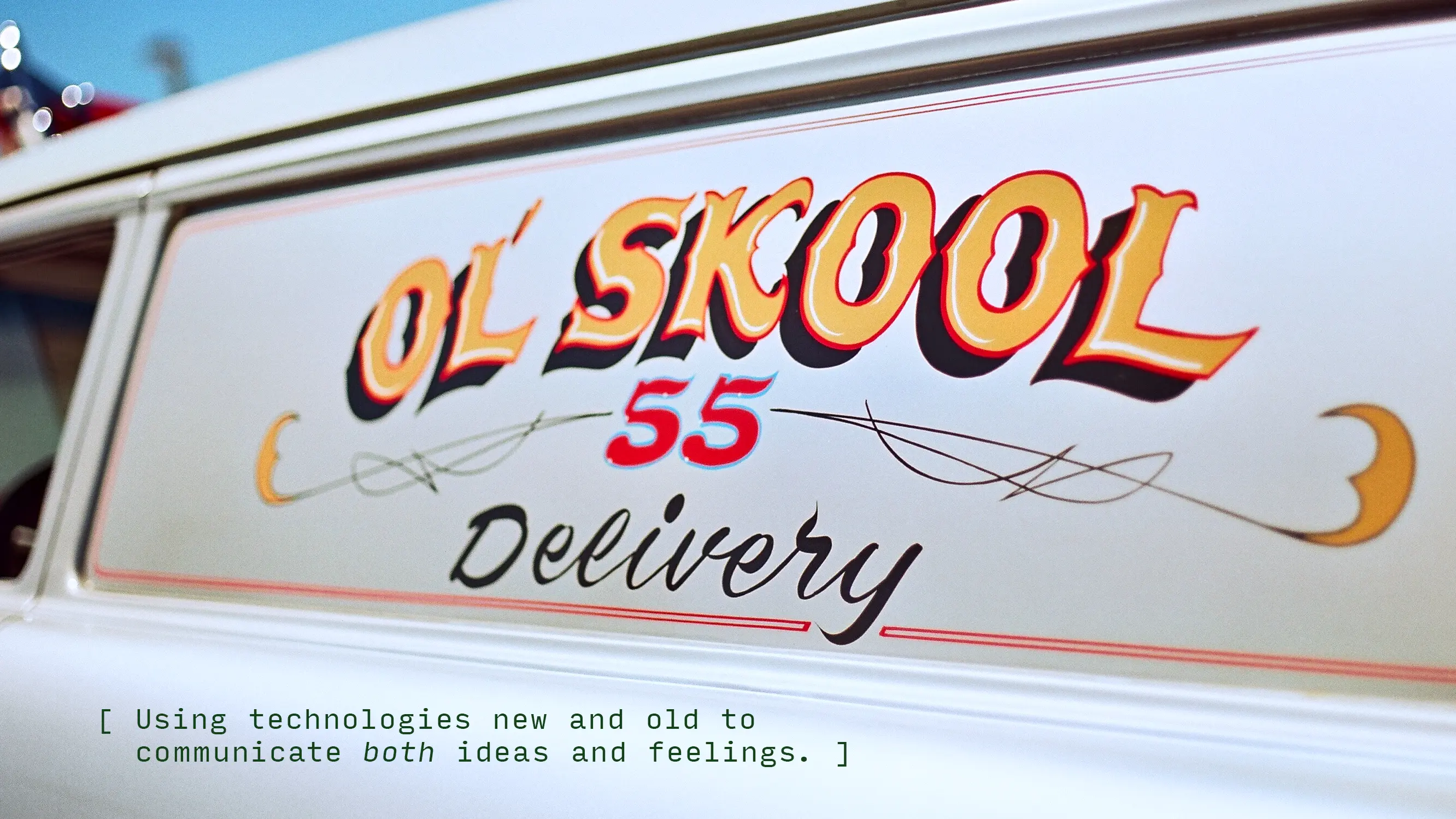
What people began to realize, however, was that there's a kind of truth in material. A film photo that's been scanned onto a computer and then posted to Instagram feels more connected to its subject matter than something that never left a digital space. A person—or a company—willing to show themselves in a way other than perfection could prove to people that they had the confidence to be authentic.
When done merely for the sake of aesthetics, it sits dangerously close to being tacky and dishonest. When done to capture a sentiment or tell a story, however, it's a way of synchronizing meaningful aesthetics to the larger message in a piece of content.
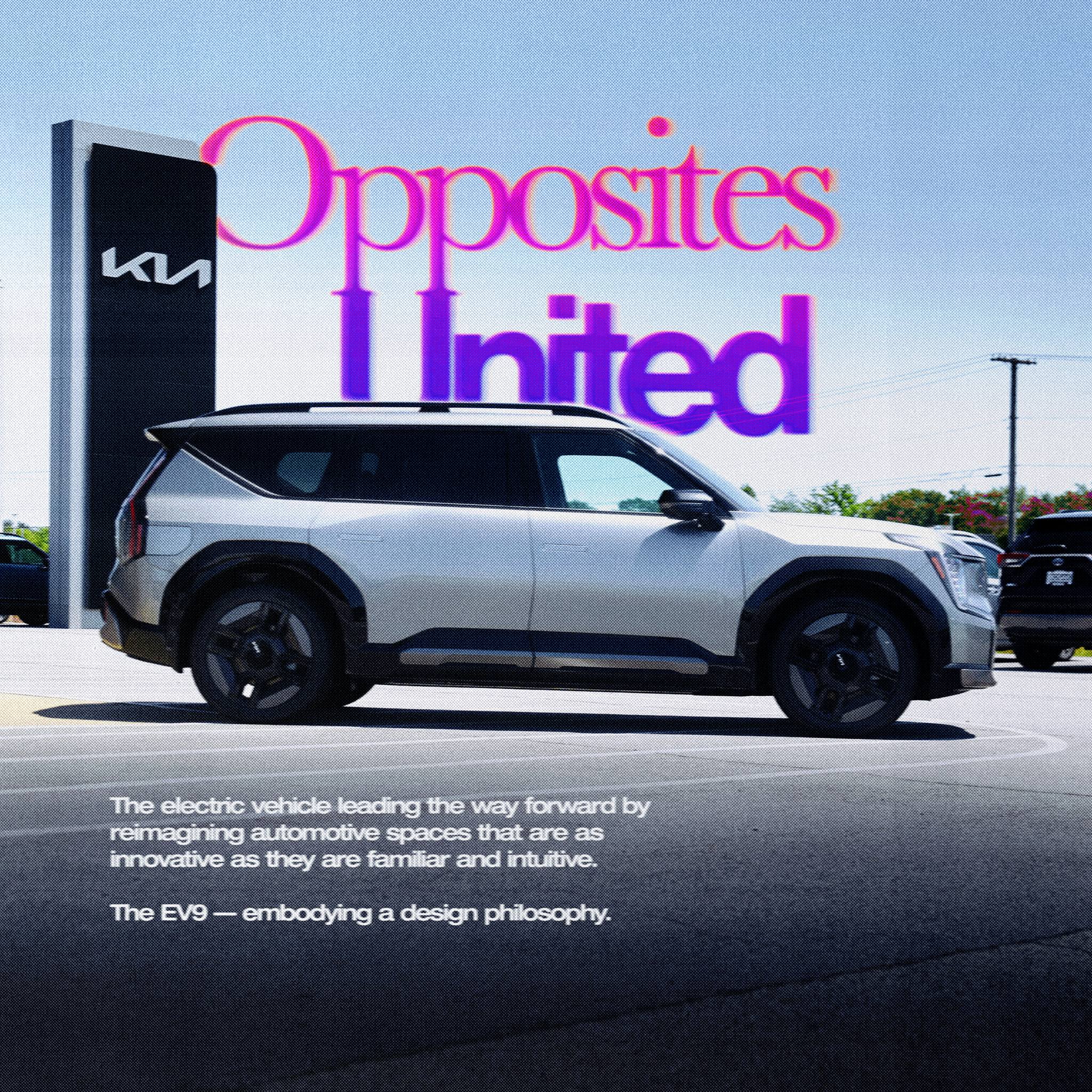
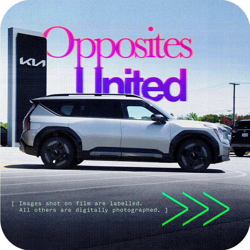
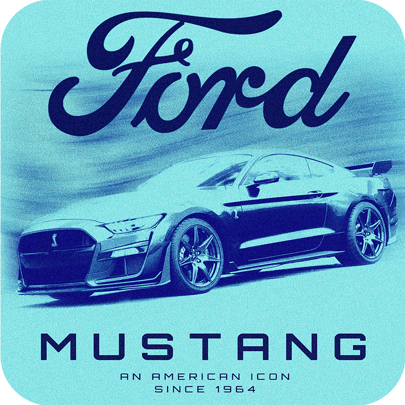
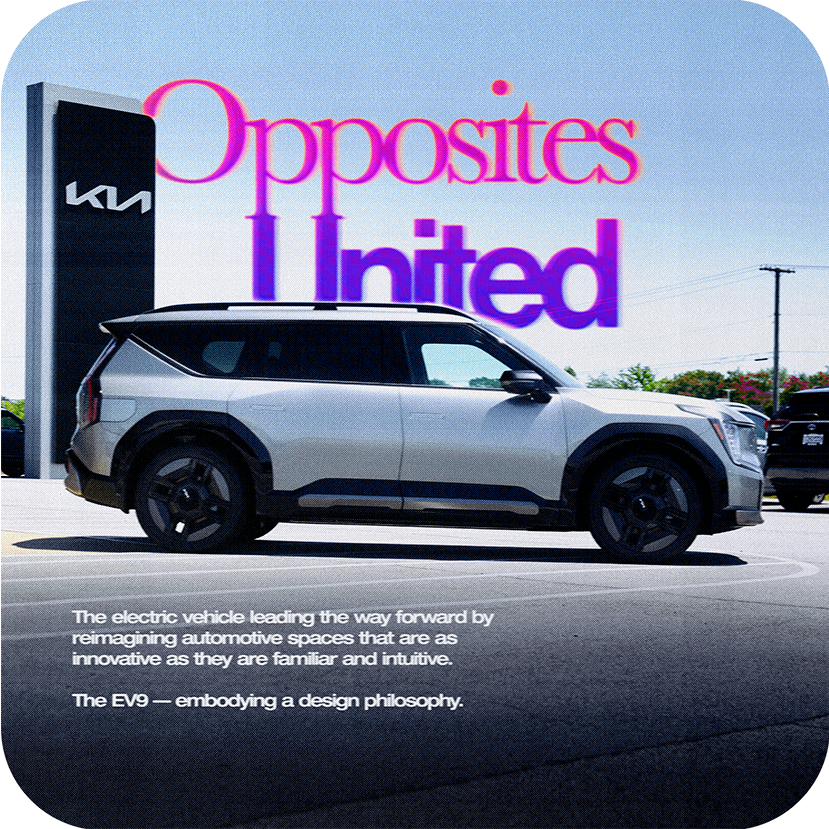
For instance, the Kia EV9 is one of the most forward-thinking vehicles on the market today. It embodies an ultramodern exterior and an interior that rethinks every detail for the driver and their passengers. However, it also focuses on intuitive UX design. On comfort. Familiarity. It all relates to Kia's current design mantra: Opposites United.
To get this idea across, we wanted to mirror the Opposites United philosophy aesthetically. The digital image is hit with paper textures and film grain. The typefaces oscillate between vogue grotesks and classic serifs. Colors mix between hot and cold. In the same way that the EV9 represents "Opposites United," so do the components in the content promoting it.
Having the confidence to step away from the aesthetics of perfection are what made this deeper connection possible.
Understanding how, why, and (most importantly) when to use an aesthetic style or trend is crucial to presenting your brand authentically. Whether it's to enrich the narrative or to show your brand more sincerely, having the confidence to embrace imperfection can unlock creative pathways and connections that otherwise wouldn't be possible.
To show yourself at your best, you have to tell your story fearlessly.
The aesthetics of the 90s and 00s were a tale of two worlds. On one hand, there were early video games that had countable pixels on the screen and a burgeoning internet that could only handle dial-up load speeds. On the other, there was the promise of a Brave New WorldTM featuring a slick style that ultimately led to Frutiger Aero and a world where every electronic device welcomed you into a pristine glossy phantasmagoria.
Tamagotchi. Mario's pixelform mustache. Cheap pulp TV guides.
iMac G3. iPod Touch. Lisa Frank.
The promise was that one of those worlds would catch up to the other. One day in the not-so-distant future, video games would be perfect replicas of real life. Digital photography could capture a moment exactly as it was. Phone screens would soon be as clear as the human eye.
So when new video games came out featuring heavily stylized cartoon graphics and creators started intentionally damaging pristine digital images with high-speed film grain, torn paper textures, printing dots, Xerox dynamic range, pixelation, or jpeg artifacts, it seemed tantamount to heresy.
What people began to realize, however, was that there's a kind of truth in material. A film photo that's been scanned onto a computer and then posted to Instagram feels more connected to its subject matter than something that never left a digital space. A person—or a company—willing to show themselves in a way other than perfection could prove to people that they had the confidence to be authentic.
When done merely for the sake of aesthetics, it sits dangerously close to being tacky and dishonest. When done to capture a sentiment or tell a story, however, it's a way of synchronizing meaningful aesthetics to the larger message in a piece of content.
For instance, the Kia EV9 is one of the most forward-thinking vehicles on the market today. It embodies an ultramodern exterior and an interior that rethinks every detail for the driver and their passengers. However, it also focuses on intuitive UX design. On comfort. Familiarity. It all relates to Kia's current design mantra: Opposites United.
To get this idea across, we wanted to mirror the Opposites United philosophy aesthetically. The digital image is hit with paper textures and film grain. The typefaces oscillate between vogue grotesks and classic serifs. Colors mix between hot and cold. In the same way that the EV9 represents "Opposites United," so do the components in the content promoting it.
Having the confidence to step away from the aesthetics of perfection are what made this deeper connection possible.
Understanding how, why, and (most importantly) when to use an aesthetic style or trend is crucial to presenting your brand authentically. Whether it's to enrich the narrative or to show your brand more sincerely, having the confidence to embrace imperfection can unlock creative pathways and connections that otherwise wouldn't be possible.
To show yourself at your best, you have to tell your story fearlessly.

creativity with
a legacy.